Monday, November 18, 2013

Jerrod's color emotions

                                                                     Amazement

This emotion made me feel and have amazement. It is set on a 400 x 300 on canvas size. I changed the canvas color to black. So the objects would stick out as a texture. I made many of stars. The reason they don't look exactly as stars was because I moved the center dots to change the points and design  of the stars. I then used the confetti effect, and changed the color of it so It gives a brighter color and thicker effect.


                                                                    Confusement

This Emotion made me feel confusement in me. It has a bunch of different observation of views. The canvas size is 400 x 300. It Has many different colors. Which makes it confusing. I put a spladder paint on the top and bottom edges. Then graffiti line in the middle. The shade of orange and yellow are an outline color. which gives the line and background a depth perception figure to me.


                                                                        Exciting

This image to me that I made is exciting. It has many different bright colors and a many direction of lines and 3D effects. The 3D effects are a value of lines.And there are highlighter marks which are the 3 different colored lines put together. The background is a darker color, because it made the lines and there colors stick out more for excitement.


 Sadness

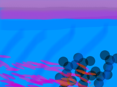
This image makes me feel sad. I used feathers, triple dots, and highlighter.  The canvas is at 400 x 300. It has a baby blue shade. and the other colors are relative to that shade of blue. It has a shade of dimmer blue going diagonal threw the picture. Blue and violet to me are a sad color and down color. It has a shade of violet at the top for a line. and the feathers are a shade of it with a darker orange.

Scared

This Image gives me a scared or danger feeling. It makes me feel and I targeted it to feel as if someone is starring at you. It has squares around the edge of the picture to make you look at one way to the center. It has a darker shade going to a lighter gray. Those colors are dark and gloomy colors to me. I put circles as a target so it makes it more like an EYE. It has dots around The inner circle for an eye effect.


Thursday, November 14, 2013


This is my professional nameplate. I did this one more  fancy like than others. To make it look "professional". I changed the background "canvas" to a black The circular rectangle has a glow effect and the outside of the shape. It has a feather effect also connecting the black line with the glow. It has a solid red background with a oil-slick texture or pattern on the name plate. The writing or format my name is in, is "AR BLANCA". Which also is "italicized".


This is my "semi professional" nameplate. First I changed the canvas color to a darker blue. I went to the doughnut effect, and made many doughnut circles so it has the circle threw a circle effect. As you can see my background in front of the blue has a fuzzy texture to it. what i did was I went into the pixels and edited them. I have my name on a centered position and the texture or type of format it is in is called, "Algerian". The design with the crossed lines going threw the middle is called "folds". I then repositioned the middle centering bar for it to have the cross way threw the middle.

Tuesday, November 12, 2013


This is my (beginner) nameplate. How I made this was I used texture and a gradient format to fit in the canvas. I made the colors not match, so it will look bright and wild. I used a circular rectangle to shape and fit inside the canvas. I used a was gradient pattern called the "wave" and on this one i did not move the centering bar. I changed my name writing or texture to "AR BONNIE". Then I moved and made the circular rectangle more circle and less rectangle.

Thursday, November 7, 2013


This is my texture plate. I used rounded ovals, and used many effects to make it look like this. I used glow effect and an overlap which had a drop shadow on each one of the circles to make it look overlapped. I changed mt canvas to black, to make a floating effect. The circles have dilated colors so each circle has a own color effect to bright or darker. I used this png because it had better detail, and the colors appeared better as so did the glow and shadow. I overlapped the circles so it looked like they were coming out of the picture or as if it was a deep looking photo.                                                                                                                                                                                                      

Monday, November 4, 2013


This is my second Name Plate. I like the effect I did in this one, I chose a 3d faded glow for my name. Which gave it the dark glare off the back of the name.  The background design i gave it was called "Folds". I moved the center bar around to give it the cross design in the background. I used a circular rectangle for the name plate. The design of the lettering is called Algerian. Then did a crtl+u which underlined and and then a ctrl+I for the Italisize. 

 I started out on my name plate, by choosing my properties. One property was my gradient background. The background I chose was The "Wave" effect. The Wave Effect doesn't originally look like this one. What I did was I, stretched and moved the middle centering bar. Which changed the design. I then typed my name In the picture, I gave it a "Glow" Effect and a Colored Shade effect behind the letters. I figured since I don't want a boring checkered outline background. I then changed the Canvas color making all the plate match.