Friday, March 7, 2014

self-portrait magazine cover


This is my magazine cover. It is ME!. I decided To use the Rolling stone magazine because they are a popular magazine company and have had a lot of famous people including me, lol. I chose sport themes for my facts, and my nickname, which is what people call me. I chose those because I like sports. I chose a collared shirt because it looks nice, And etc My hair is messy because my hair looks like that. My eyes are greenish bluish and as you can see I have braces. I put the new designer of shoes, because I really like shoes and I think it would be really cool to design shoes when I get older. Basketball shoes and running shoes. Well this is me on A rolling stone magazine. Thanks

Friday, February 7, 2014

logo redesign-gatorade

   This is my redesign of my "gatorade logo". On the left are the oldest gatorade logo, going downward to the newest logo. I figured since gatorade has many flavors, the rain in the design is the flavors pooring down. And the lightning bolt is the "gatorade lightning bolt" which is coming out of the cloud of gatorade. 


This is My busiess card. I work for gatorade industries. former and processor of the worlds best sports drink. On my business card, I used my redesigned logo and put my information on the middle right. Then the colors I used for my business card are all shown down below of the business card.

Tuesday, February 4, 2014

logo redesign-hotel-Jerrod


This is my Logo redesign. I chose to do the Hotel logo. I started by using the circle and making a big circle. then i created the "sea" part and changed the color. The palm trees are 2 rectangles, which for the leaves I redesigned the "circle" and bended it which made it look curved and a leave type deal. My color sceam is at the bottom which represents the colors I used in this logo to do it.

Friday, January 31, 2014

2 fruits_MangoMelon

 This is the MangoMelon!

This Is my New Fruit, It is the MangoMelon. What I did was I used 2 photos, one of a Watermelon, and another of a mango. Then I cropped out the rest of the photo of the watermelon, and pasted it on the mango slices. I then cropped and edited it to fit on the slice just right, Which fitted it. Then with the parts of the watermelon hanging over the slices I erased those parts.

Thursday, January 30, 2014

pictography-Jerrod_chicago bulls

I did my photography on the "Chicago bulls" mascot. Which is a bull. I started out with doing the for-head of the bull and making it red. Then on the horns, I made a re sample of the bull and made it smaller. The I overlapped the smaller bulls so that mostly only the white of the horns were showing, so that it would look like a horn. On the eyes, I used "gray scale", to make the bull "darker" so it would look like an Eye. Same as the nose holes, I used "gray scale" so the nostrils of the bull was dark.

Friday, January 24, 2014

Jerrod Harn-Black Swan- business cards


This is my UN-professional business card. What I did was I changed the canvas to black, then I pasted the swan logo in the middle, and made the design the "fold" effect. I used a text box to write the information. Then I changed the font and size to look and fit with the picture.


This is my semi-professional business card, I changed the canvas to a purple/violet shade, Then the swan I used "satan" effect, and changed it to where it matched the canvas.  I changed the font of my writing and changed the color, then I put a star next it, and changed the shape and color.


This is my professional business card. For the background, you see a mountain range and a lake, what I did was I copied and pasted the photo, then i changed the color to match the rest of the card. I used text boxes to write the words, Then I changed the font and color. The background, I did a mask for the background to be a mountain range with a lake.


Wednesday, January 22, 2014

typhography- benjamin franklin


 This is my typography of Benjamin Franklin. I used words, and phrases that describe Benjamin Franklin, or were said by him to put in the photo. Then i changed the size and color of the letters, to fit and not easily be seen in the photo . I used the color of the face and hair and etc. to pick the coor for the words to blend in with the photo. Then when I took the photo away, I could see Benny. The face and forehead, what I did was I used a famous speach he said and put it in his face then changed the editing color to blend in with his skin. His chest and neck area are short sayings he said. for most of the words that describe Ben, I did "change to paths", then a "ctrl+shft+G". That un-groups the lettering so you can move each letter separately.


Tuesday, December 17, 2013

butterfly&flower


This is my butterfly and flower portrait. This project, I used the line tool for the flower. The stem I, put a bunch of lines as I did for the little flower. The boarder, I did was big squares, and put them to "arrange behind." The butterfly, i used 2 ovals, and arrange them and put points on them to arrange them. Thebody of the butterfly is just an original oval, And the antennas are "swirls".  


Friday, December 13, 2013

Basketball_grayscale


 Top: original
bottom: edited


For this one what I did was I used the lasso tool. I drew a circle around the basketball and pressed ctrl+shift+I and then did "grayscale". which left the basketball colored and the picture blacked out

Thursday, December 12, 2013

dirtbike_landscape


Top: original
bottom: edited

This is my favorite landscape one. I used the sepia tone one to highlight and edit the background to change the edit.Then I used the lasso tool to highlight around the motorbike and used sepia tone. I also used the lasso tool to highlight around the mountains. and used sepia tone for those ones also.

Landscape- train

Top: original
bottom: edited


This is my landscape photo. I used this one because it has a good color with the train, and the background is neat with the wavy water and mountains. I used the lasso tool to highlight around the the train, and did the sepia tone for the plain background. I pressed Ctrl+shift+I to highlight the hole background which gave it the effect.

Wednesday, December 11, 2013

Raintree


This is my rain tree design. I got the photo and downloaded it to fireworks. What I did first was I took the Lasso tool, and circled all the way around the tree so the whole background was a sepia tone. The sepia tone was an effect I could use to make the background change. Then I zoomed in To the pixels, and I Highlighted every pixel so I could change the blue background sky effect to a sepia tone. I did that until i got all the blue away.

Friday, December 6, 2013

MY alphabet - "The gloomy alpahabet"


This is the alphabet I created. I changed the points on the letters and added points for them to look like points and a bit "scary". I call this font "gloomy". It has a dark feeling to it, an puts me on the spot. the letters are pointy and some are curvy. Which to me, contrast me for confusion. This is my "gloomy" alphabet.

Monday, December 2, 2013


This is my cornucopia. I set the canvas to a orange brown in the color codes. I used doughnut shaped circles to make the cornucopia basket. I aligned them and made them smaller as they go to the back of the basket. It has different color fonts on the doughnut rings for realistic in the basket. I changed put "dots" on the canvas for a fall effect. Then i put leaves in the canvas also. I made leaves by doing The "star" effect, and changed the centering and arm points to get the extra points. My Food. For my food I used the circle shape for most of my food designs. Then I would use the pencil tool to edit the food. For example on the tomato and etc. I made the stem green and designed it to look like the top part of the food. Same with the carrots, grapes, apples, corn, eggplant, and more. On my pumpkins I used a big circle and used the line tools to make the lines in the pumpkins. then I used the points to curve them. My corn I made a bunch of little circles by making one then Pressing "ctrl+alt" to duplicate a lot of the circles. Then colored them to look in a group. I did the same for the grapes. And the multiples of the corn. Another detail I did in my basket is I put a shaded highlighter glow to make it look like the basket isn't completely black, but to make it as if you can see threw the winds and weaves. That is how I made my "cornucopia". 

Monday, November 18, 2013

Jerrod's color emotions

                                                                     Amazement

This emotion made me feel and have amazement. It is set on a 400 x 300 on canvas size. I changed the canvas color to black. So the objects would stick out as a texture. I made many of stars. The reason they don't look exactly as stars was because I moved the center dots to change the points and design  of the stars. I then used the confetti effect, and changed the color of it so It gives a brighter color and thicker effect.


                                                                    Confusement

This Emotion made me feel confusement in me. It has a bunch of different observation of views. The canvas size is 400 x 300. It Has many different colors. Which makes it confusing. I put a spladder paint on the top and bottom edges. Then graffiti line in the middle. The shade of orange and yellow are an outline color. which gives the line and background a depth perception figure to me.


                                                                        Exciting

This image to me that I made is exciting. It has many different bright colors and a many direction of lines and 3D effects. The 3D effects are a value of lines.And there are highlighter marks which are the 3 different colored lines put together. The background is a darker color, because it made the lines and there colors stick out more for excitement.


 Sadness

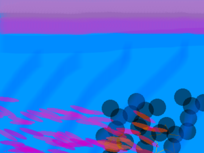
This image makes me feel sad. I used feathers, triple dots, and highlighter.  The canvas is at 400 x 300. It has a baby blue shade. and the other colors are relative to that shade of blue. It has a shade of dimmer blue going diagonal threw the picture. Blue and violet to me are a sad color and down color. It has a shade of violet at the top for a line. and the feathers are a shade of it with a darker orange.

Scared

This Image gives me a scared or danger feeling. It makes me feel and I targeted it to feel as if someone is starring at you. It has squares around the edge of the picture to make you look at one way to the center. It has a darker shade going to a lighter gray. Those colors are dark and gloomy colors to me. I put circles as a target so it makes it more like an EYE. It has dots around The inner circle for an eye effect.


Thursday, November 14, 2013


This is my professional nameplate. I did this one more  fancy like than others. To make it look "professional". I changed the background "canvas" to a black The circular rectangle has a glow effect and the outside of the shape. It has a feather effect also connecting the black line with the glow. It has a solid red background with a oil-slick texture or pattern on the name plate. The writing or format my name is in, is "AR BLANCA". Which also is "italicized".


This is my "semi professional" nameplate. First I changed the canvas color to a darker blue. I went to the doughnut effect, and made many doughnut circles so it has the circle threw a circle effect. As you can see my background in front of the blue has a fuzzy texture to it. what i did was I went into the pixels and edited them. I have my name on a centered position and the texture or type of format it is in is called, "Algerian". The design with the crossed lines going threw the middle is called "folds". I then repositioned the middle centering bar for it to have the cross way threw the middle.

Tuesday, November 12, 2013


This is my (beginner) nameplate. How I made this was I used texture and a gradient format to fit in the canvas. I made the colors not match, so it will look bright and wild. I used a circular rectangle to shape and fit inside the canvas. I used a was gradient pattern called the "wave" and on this one i did not move the centering bar. I changed my name writing or texture to "AR BONNIE". Then I moved and made the circular rectangle more circle and less rectangle.

Thursday, November 7, 2013


This is my texture plate. I used rounded ovals, and used many effects to make it look like this. I used glow effect and an overlap which had a drop shadow on each one of the circles to make it look overlapped. I changed mt canvas to black, to make a floating effect. The circles have dilated colors so each circle has a own color effect to bright or darker. I used this png because it had better detail, and the colors appeared better as so did the glow and shadow. I overlapped the circles so it looked like they were coming out of the picture or as if it was a deep looking photo.                                                                                                                                                                                                      

Monday, November 4, 2013


This is my second Name Plate. I like the effect I did in this one, I chose a 3d faded glow for my name. Which gave it the dark glare off the back of the name.  The background design i gave it was called "Folds". I moved the center bar around to give it the cross design in the background. I used a circular rectangle for the name plate. The design of the lettering is called Algerian. Then did a crtl+u which underlined and and then a ctrl+I for the Italisize.